
A Wee Little Tableau Tutorial
Begin to wield the power of Tableau by connecting to live data sources and creating dynamic visuals
Tableau is a common data visualization tool used across many industries. Being able to effectively utilize Tableau to create meaningful insights for project and product managers is a
Prerequisites:
- Tableau Desktop installed on your computer (You can download a trial version from the Tableau website).
- A dataset to work with. You can use the sample Superstore dataset that comes with Tableau or your own data.
- I recommend finding a dataset that interests you and that you understand the context of. For example, I’m using a downloaded Star Wars dataset found here. Let’s get started.
Step 1: Connect to Your Data
- Launch Tableau Desktop.
- Click on “Connect to Data” to open the data source pane.
- Select your data source, whether it’s a database, spreadsheet, or other file type.
- Connect to your data by specifying the connection details or browsing for the file.
- For the Star Wars data, I simply clicked “More…” in the left pane which opened a file browser. I found my file from there and opened it.
Step 2: Explore Your Data
Exploratory data analysis is always important before you start heavy-lifting. Follow these steps to poke around your data and make sure it looks and behaves like you want:
- Drag and drop dimensions and measures onto the Rows and Columns shelves to view the data table.
- Use the “Show Me” panel to explore different chart types.
- Filter and sort your data to uncover insights.
Step 3: Create Worksheets
Worksheets are like the tiles that make up your flooring. Your first one will be initialized for you as Sheet1. Make as many worksheets as you need by following these steps:
- Click on the “New Worksheet” tab at the bottom of the window. (Or use Sheet1 if this is your first worksheet.)
- Drag and drop fields from the Data pane to Rows and Columns shelves.
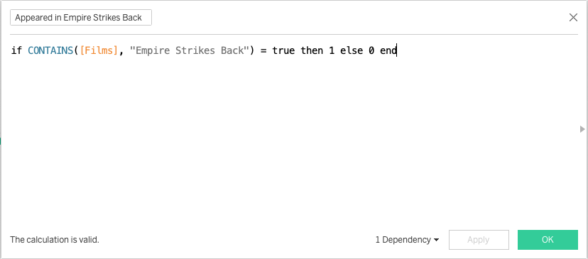
- Note: Create new fields by right clicking empty space in the left pane and selecting “Create calculated Field.” This opens a SQL-like query box where you can manipulate the data as you like.
- Customize your visualization by choosing chart type, colors, and formatting options.
- Note: Click “Show Me” on the top right to open a view of all the charts available given your selected fields.
Step 4: Design Your Dashboard Layout
Now that you have your worksheets, it’s time to design the layout for your dashboard. Follow these steps:
- Click on the “Dashboard” tab at the bottom of the window.
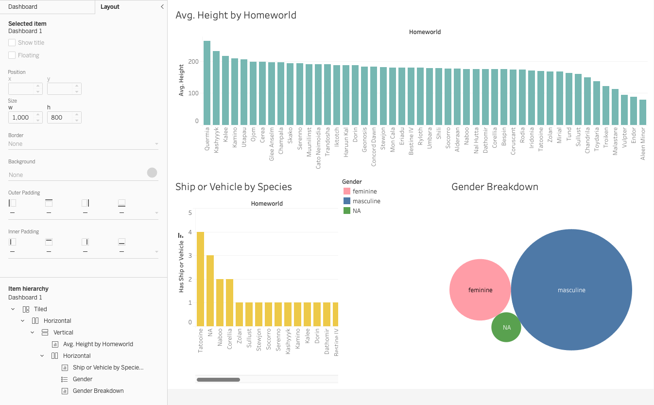
- Note: You’ll see a blank canvas for your dashboard. To the left, you have the “Objects” pane, which contains various items you can add to your dashboard.
- Drag a “Horizontal” or “Vertical” layout container to the dashboard canvas. This will serve as a container for your worksheets.
- Drag worksheets from the “Sheets” pane to the layout container. You can arrange them by dragging and dropping, and you can resize them by clicking and dragging the edges.
- Add titles and text to provide context for your dashboard.
- Note: Sometimes, I get lost in the sauce and have no idea where each object really is in relation to each other. To find out, click “Layout,” then open all the hierarchy tabs to find out which object is in which container.
Step 5: Add Interactivity
Adding interactivity allows views of your dashboard to adjust their view. Consider some of the following:
Filters: Drag and drop fields to create filters that allow users to refine the data displayed on the dashboard. Actions: Create actions that link different worksheets or dashboards together. For example, clicking on a data point in one chart can update another chart. Parameters: Parameters allow users to input values to dynamically change aspects of the visualization.
Step 6: Publish and Share
Once you’ve created your dashboard, you can share it with others:
- Click on “File” and select “Save” to save your Tableau workbook.
- Publish your dashboard to Tableau Server or Tableau Online if you have access to these platforms.
- Export your dashboard as a PDF or image to share via email or other communication channels.
Conclusion
In this tutorial, you’ve learned how to create a simple dashboard in Tableau. You started by connecting to your data, exploring it, and then designing a layout for your dashboard. You added interactivity, formatted and styled your dashboard, and learned how to share and maintain it. With these skills, you can effectively present your data and insights in a visual and interactive way. As you become more proficient with Tableau, you can explore more advanced features to create even more powerful dashboards. Godspeed, soldiers!